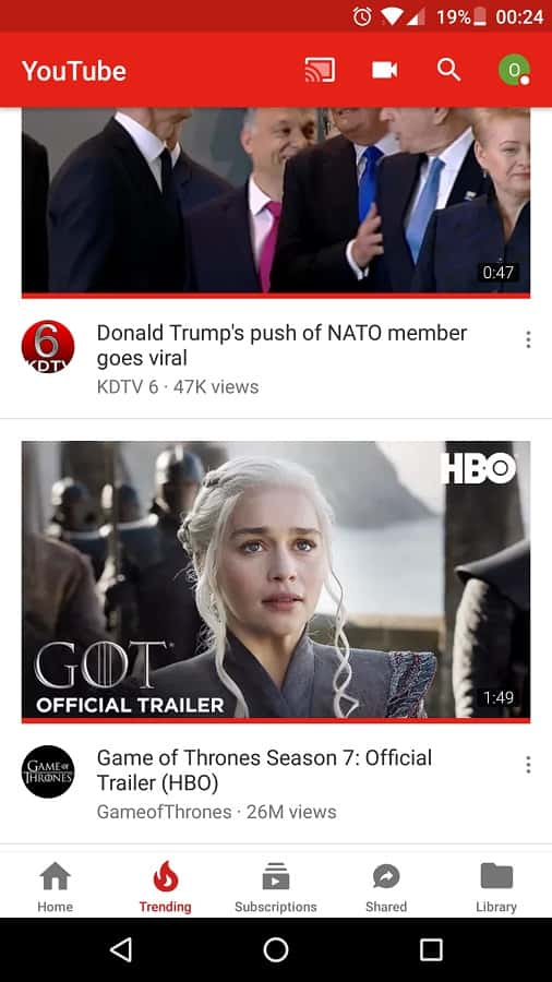
YouTube navigation tab now appears on the bottom of the screen. What could be the possible reason for such repositioning? Designers and UI/UX experts well understand the strategy behind this move.
Navigation Bar of YouTube Moves Closer to Thumb
YouTube has been the dominant video platform since a long time. Understanding the importance of engaging users with video and related digital content, technology giant Facebook came with the big announcement of introducing ‘Watch’ tab to resonate with the interest of video lovers. Facebook Watch tab pampers its users with recommended videos and additional features of commenting, liking and expressing opinions on videos that friends are watching. To beat the competition and improvise on user interface elements, YouTube came up with a drastic change in its design. The navigation bar is placed at the bottom of screen considering its proximity to the thumb, thereby making it easier for users to operate the app with one hand. Mobile app development companies are paying acute attention to user experience and interactive quotient. Developers and designers work together to figure out the exact placement of different elements of mobile app. YouTube has strategically repositioned the navigation bar after analyzing how convenient it would be for users to access it if placed at the bottom of screen.
Redesigned YouTube Logo
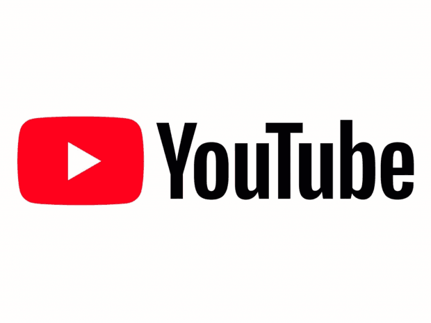
The much-known logo of YouTube with ‘Tube’ written under the red colored tube structure for better focus is now changed. The focus is now on the play button. If you haven’t noticed the changed in YouTube logo yet, here’s the small description that would help you distinguish the new logo from old one. The updated logo consists of the YouTube icon, the one having a red tube with a white screen and its trademark red play button, followed by the ‘YouTube’ word in black. This logo has a new color scheme and font style. Brand logo is the identity that is closely associated with it. Logo design and redesign does not happen quite frequently, but when any changes to logo are made, there is deep strategy and logic behind it. Some factors that go into consideration while designing and redesigning the logo of brand include current design market trends, changes in user behavior and device specifications from where this app would be accessed the most. YouTube logo has a flexible design and perfect visibility even in smaller screen sizes.
Rising Importance of UI/UX in Mobile Apps
Developing an app that has user-friendly interface, easy navigation and interactive UX is as important as building a feature-rich and highly functional app. How does the mobile app look like is a part of its design. Only when users like the look and feel of app, they go ahead to explore it and try new features. Understanding this user behavior, companies are approaching UX design service providers to improvise the design aspects of their mobile app. With so many advanced apps available in each category, users do not like to settle or compromise using apps that offer mediocre UX. When the best ones are available and easy accessible, no user would compromise on UI/UX factor of mobile app. YouTube and Facebook experts predict user behavior considering the current market trends and redesign it foreseeing the immediate future. These technology giants are also in the race for innovation and constantly trying to improvise user experience in every possible way.

