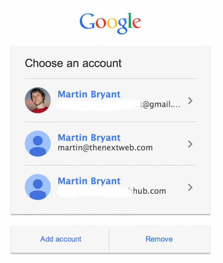
Here is what organizations with Google Apps need to know:
The Google Apps sign-in page can no longer be personalized with colors and custom logos. It will now look the same across all Google sign-in pages. Users will have to log in with their full email address (example: [email protected]). For single sign-on (SSO) domains with a network mask, users will be presented with the new Google sign-in page when they log in from outside the SSO network mask. This change does not affect SSO domains without a network mask.
The updated design is meant to be consistent across all the Google Apps services, including Gmail, Google Calendar, and Google Drive. Google hopes the change will improve security by getting users accustomed to the same login process across all its services, though as we’ve pointed out before, some enterprise companies probably won’t be too happy that their branding is being stripped.
Furthermore, the change could end up confusing many as they won’t be sure if they’re logging into the right webpage. On the other hand, the sign-in page does make it easier for users to switch between accounts, as it saves all your log-in history so you can simply enter the password to access a specific account. Google originally announced the new sign-in page would be available “early next year.” Now we know that means the roll out will start now and end next month. See also – Google Apps now lets you share Docs, Slides, and Drawings without forcing recipients to sign in and Google drops Internet Explorer 9 support in Google Apps less than three weeks after IE11′s release Top Image Credit: Kimihiro Hoshino/Getty Images
